
Capella (Pitch)
2024
Competitor Analysis / User Journey / Information Architecture / Website Refresh
In Essense:
A brand that specialises in unique and localised experience for travellers, weaved into offerings like accommodates and dining within the space. The website revamp was asked to elevate itself from other competitors.
Understanding the brand & industry
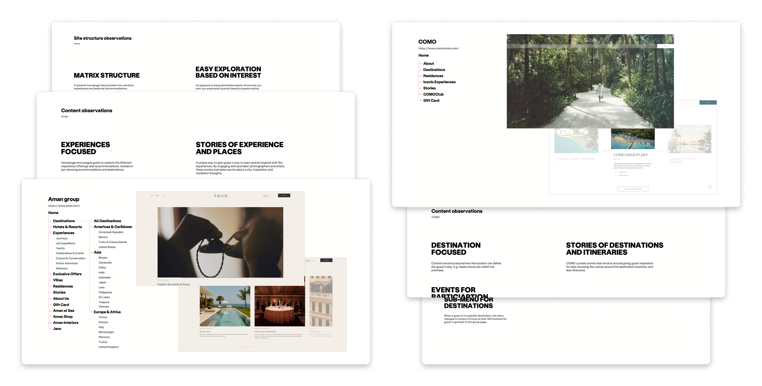
Capella, a brand that I only had heard of but never had a chance to experience. It was vital to get into a deep dive into the industry they are in, and their closest competitors. This gives a chance to extract out learning points with the lens of a typical consumer (like me), and with the lens of a UX designer to spot any surface level problems.
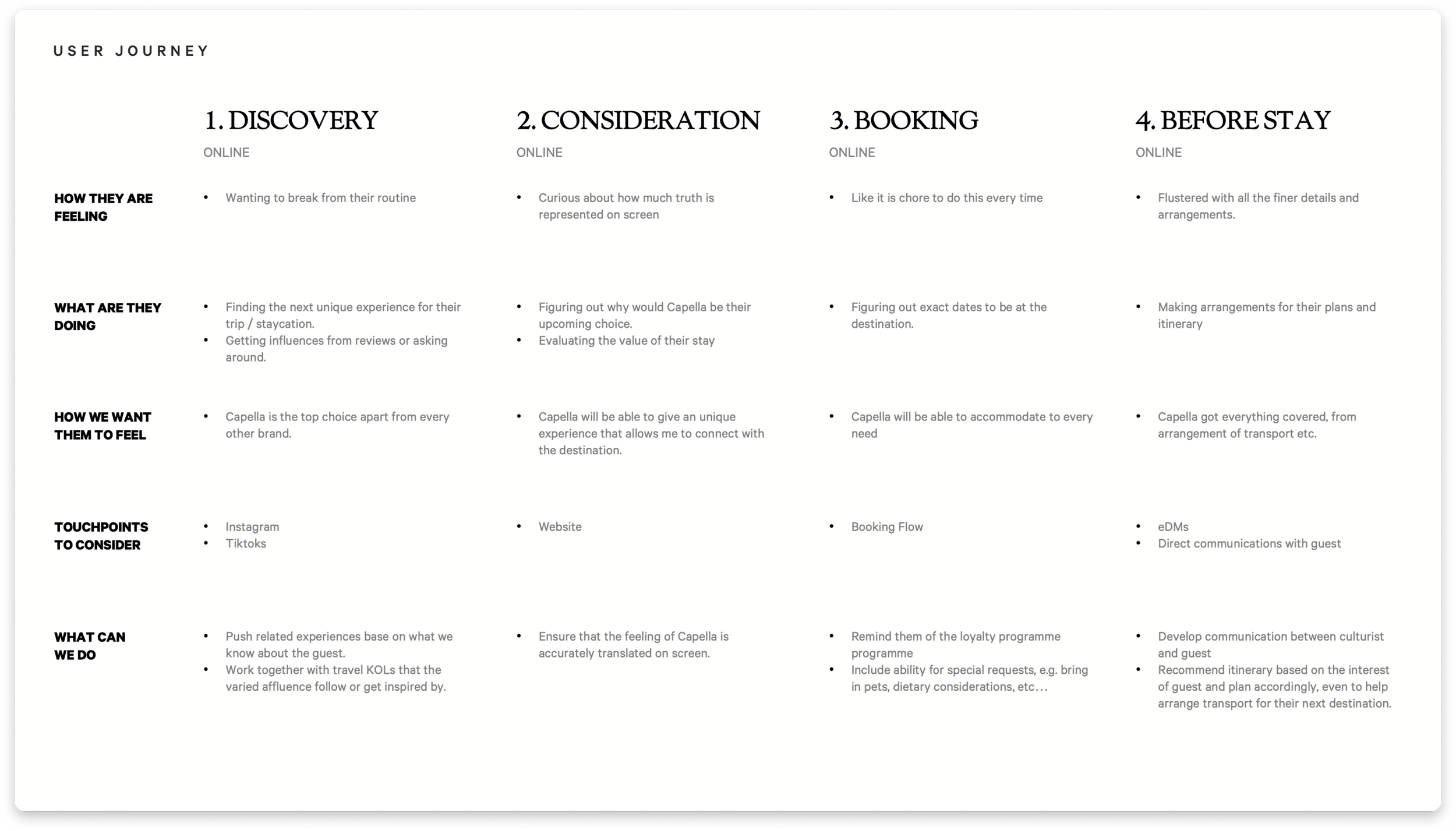
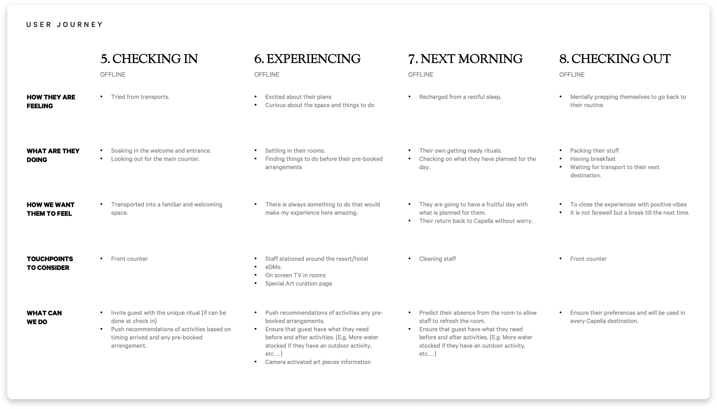
In the role of booking a luxury experience
Next step was to get into the mind of a potential customer, starting from how would I even find out about the brand, offerings, booking experience. All the way to actually being there. Trying to figure out potential offline-to-online opportunities.
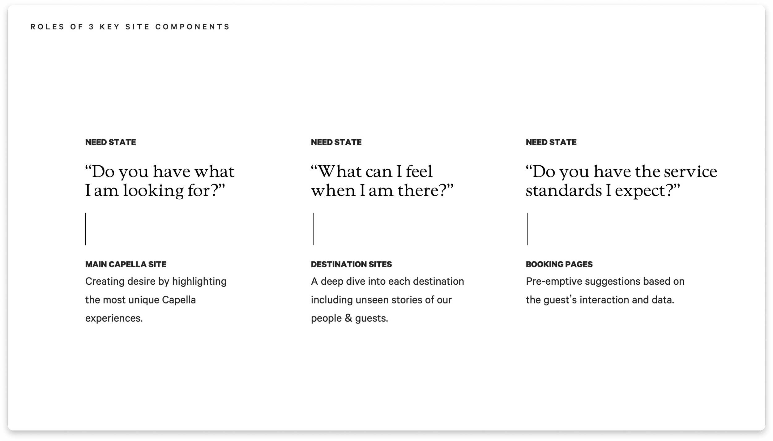
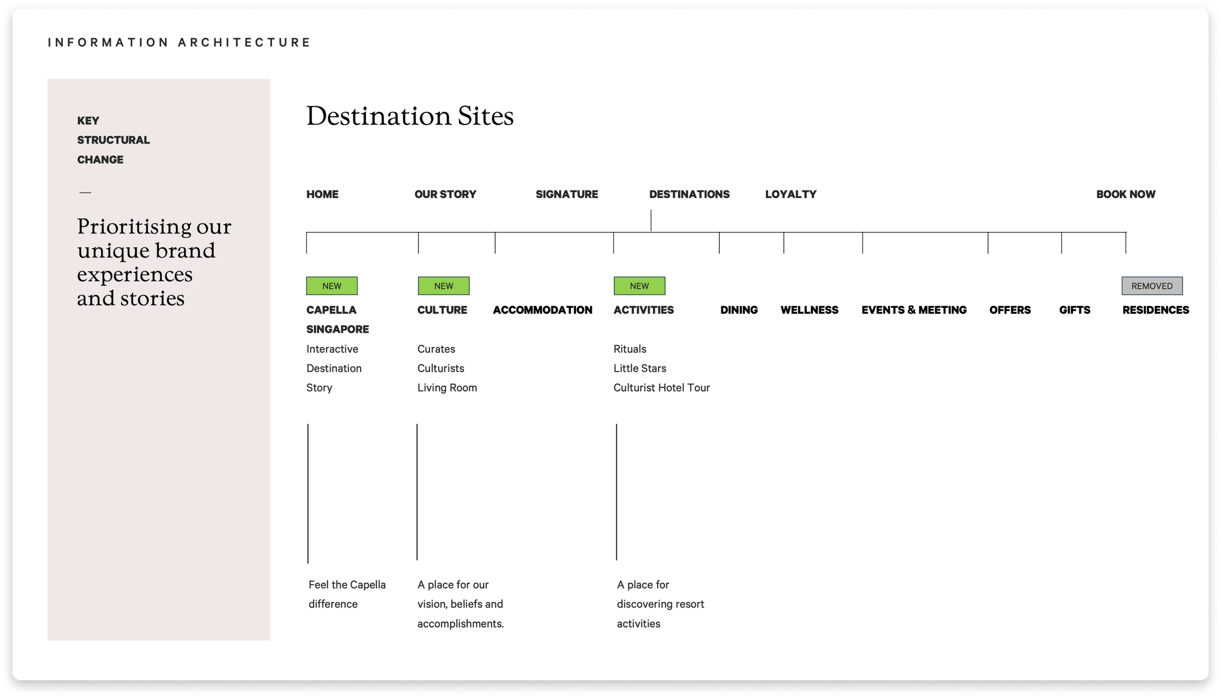
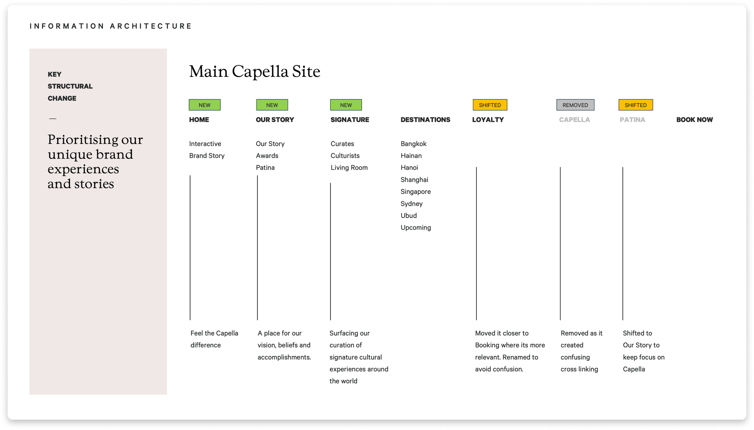
Organising a new Information Architecture
During the research phase of the pitch, many weird pages and links on the navigation were observed. Together with the new experience concept developed, a new IA was needed to ensure a better navigation and expression of the concept.
Website Refresh
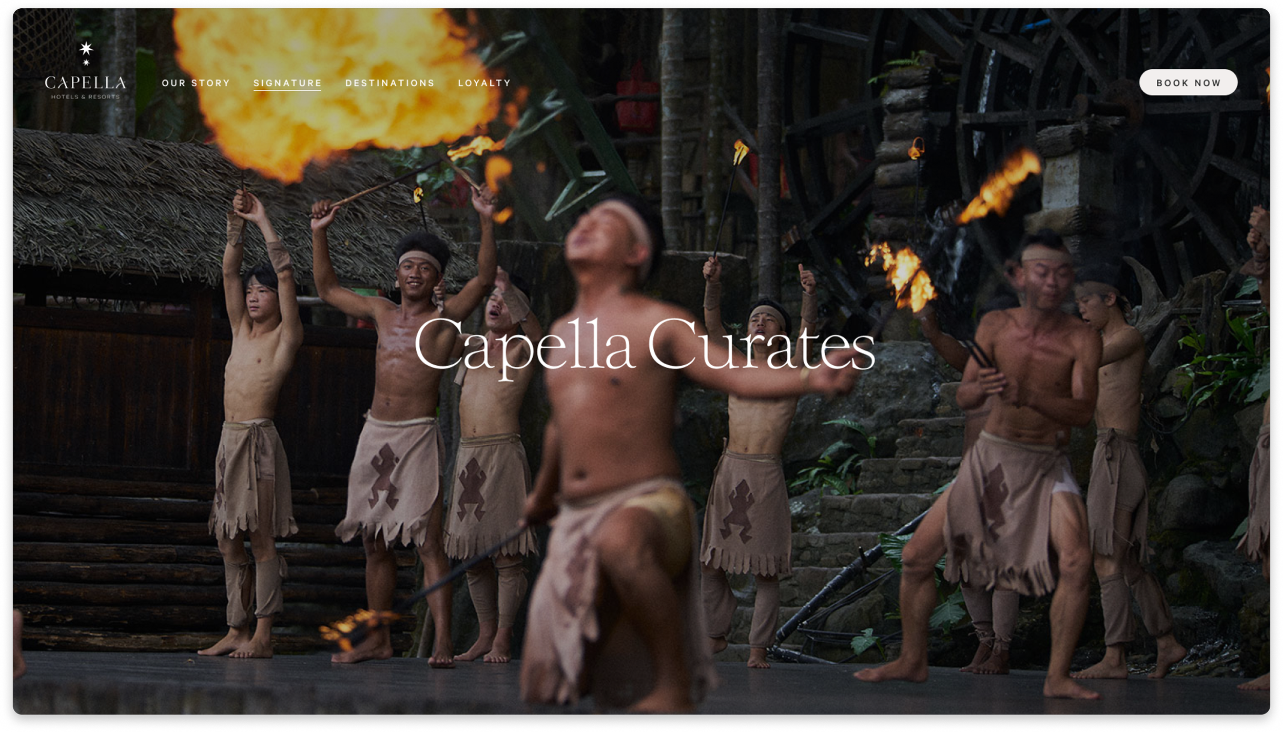
Welcoming visitors with stories
Welcoming visitors with stories
The homepage was redesign to start with a showcase of the unique experiences by Capella.
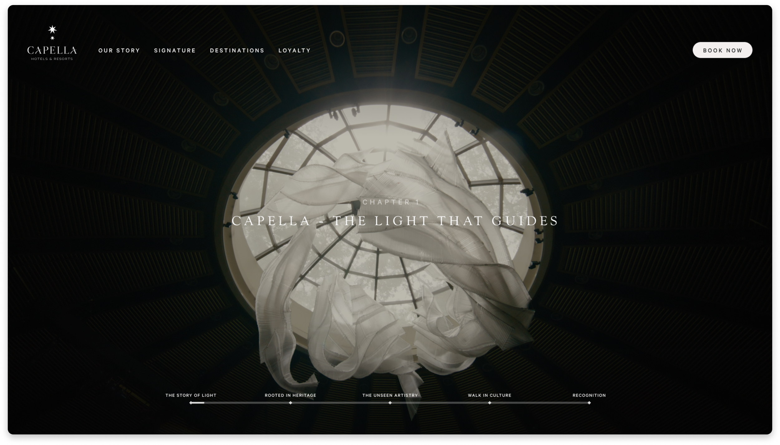
Paired with amazing imagery with an audio narrative to set the mood.
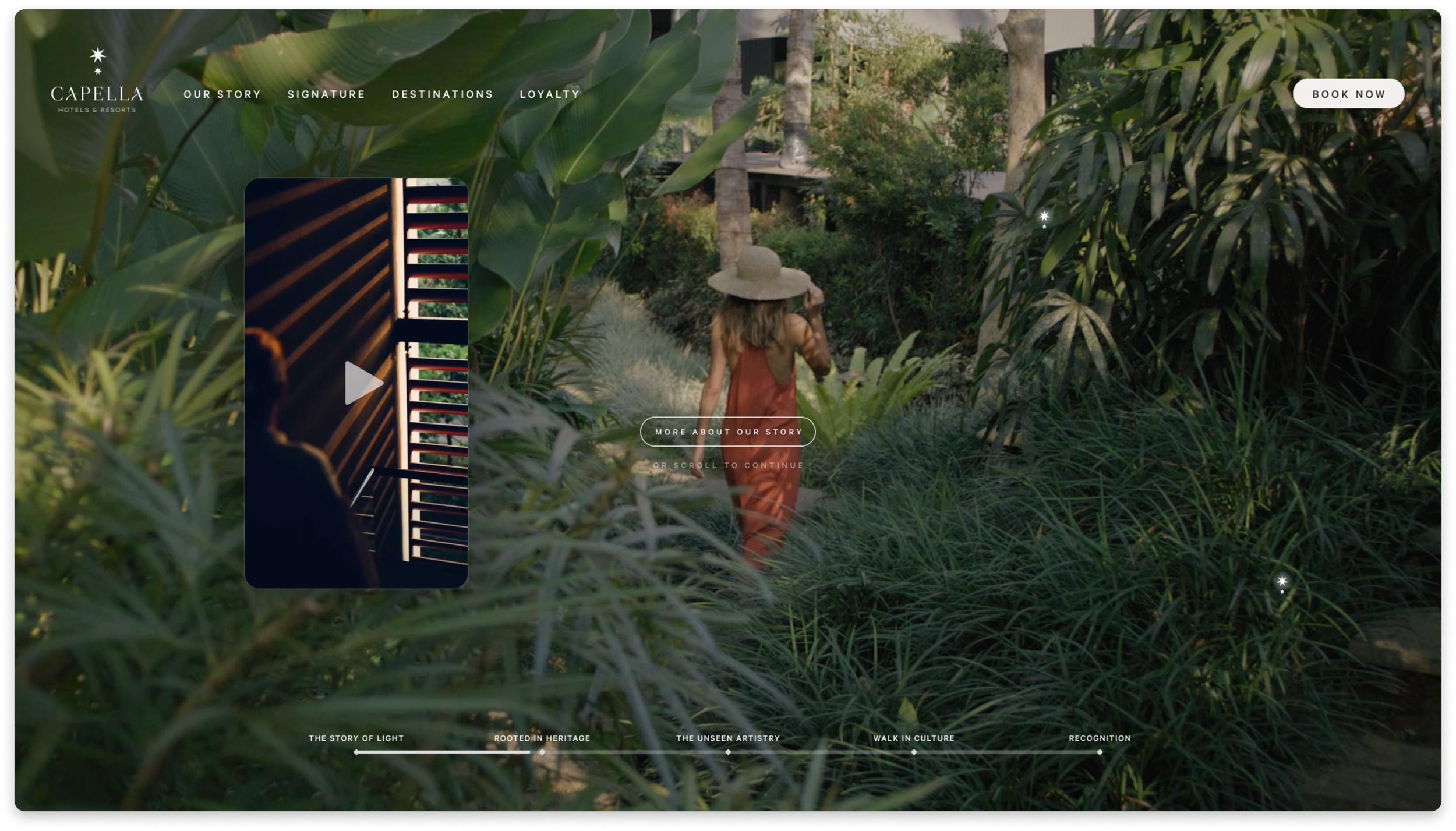
A new idea to incorporate vertical videos to give a personal expression of the experiences people had in the space.
Editorial approach to curated experiences
Editorial approach to curated experiences
The homepage was redesign to start with a showcase of the unique experiences by Capella.
Carefully selected imagery, as if you are reading your next adventure
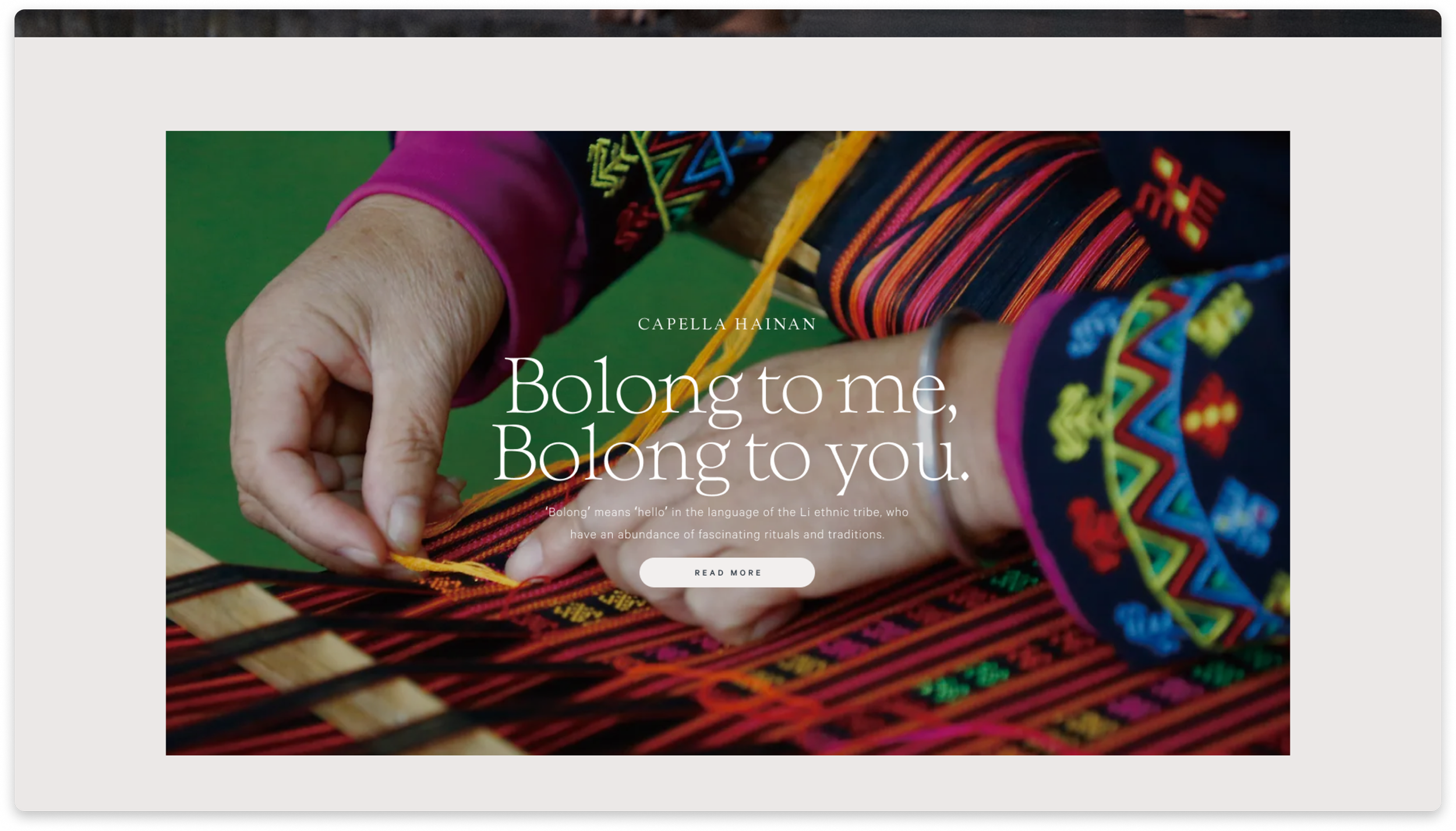
Mixing with website technology to customise imagery you are familiar with when entering from a paid advertisement.